About the project
Direct Line sells insurance through four different brands, each with its own visual identity. Great for appealing to different customers, but a challenge when it comes to maintaining design standards and consistency.
This was starting to affect the performance of online forms. There were simply too many of them. Some were good, some were bad, but all were different. It was impossible to identify whether success or failure was down to brand, product, price, or the quality of the form.
I was asked to create a new set of form components that could be used across all brands and screen sizes.

A selection of contrasting form styles available across DLG brands.
Research
Digital companies like to stand out. They often break conventions in an attempt to be different. But with forms this approach often backfires. Conventions exist for a reason. Customers are used to doing things a certain way. And in this context being different usually means being difficult.
With this in mind I began researching the most heavily used forms on the web to get a sense of the different layouts and components users were familiar with. I also learned from industries where capturing information quickly and accurately is crucial – like government websites.

Research findings – bad practise.

Research findings – good practise.
UX challenges
- 1. Rule of thumb
- The controlled environment of a UX lab is very different from the noise and distractions of the real world. So instead of creating intricate designs requiring laser like attention, I decided on a core design principle – that all form components should be easy to navigate using only a thumb. This became, quite literally, a rule of thumb. It meant more buttons, fewer drop downs, and minimal fuss.

Reality doesn’t reflect the calm environment of the UX lab.
abc
- 2. Flexible components
- Components had to perform consistently across all screen sizes, devices, operating systems, and respond to touch as well as clicks. This was the biggest challenge. To create a set of components that could work with any type of form.
- 3. Contextual help
- Some insurance topics require contextual help. Things like the type of lock fitted to a front door, or the specific alarm system installed in a car. This information is usually hidden or lost in the congested column of help icons cluttering the page. I wanted to draw attention to the really important hint text for the common ‘problem questions’.
UX solutions
I used the conventions and best practises identified in my research as the basis for some early wireframes.
The text input fields were sized to give affordance (a visual clue) to the type of information required. For example the input box for email address would be significantly longer than that for postcode. That meant forgoing clean edges in favour of functionality.

Length of text fields give affordance (visual clue) about the information required.
— PROJECT NAME
Name
— ROLE
Role
— DATE
Date
Elements like radio buttons and check boxes – where a customer chooses from a range of options – had to be consistent across all devices. Issues with spacing and alignment had to be avoided; for example, where a label drifts from its corresponding button as screen size changes. This was overcome by enclosing these components inside buttons. The buttons themselves would look the same on different screen sizes, with a flexible arrangement that could change responsively e.g. stacking on mobile.

Radio buttons and check boxes were designed as self contained components.
— PROJECT NAME
Name
— ROLE
Role
— DATE
Date
The treatment of help text was guided by two principles. Firstly, it should only be included where necessary. This advice sounds obvious but often isn’t followed. The most common example is help text that simply repeats or reframes the question, for example ‘please enter your date of birth’. In cases like this, it should be removed. The second principle was to automatically display help text for ‘problem questions’ – ones users typically struggle with. For these questions I saw no sense in hiding useful information behind icons.
This approach ensured that all help text had to be relevant and make an impact.
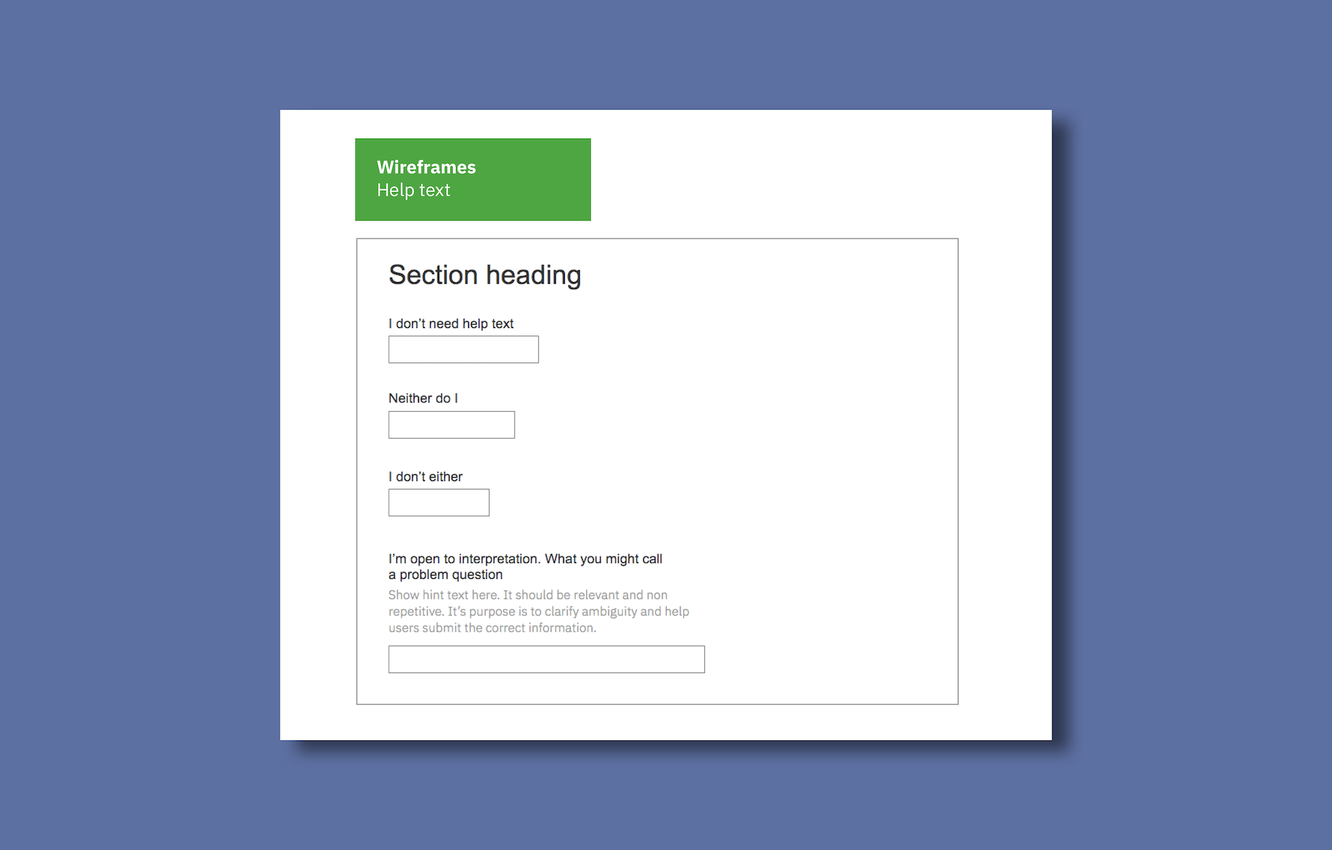
Approach to help text.
Testing
The home insurance quote is long and complicated – the perfect test.
I created a prototype using the new the form elements and ran user testing against the existing quote. The results were conclusive. The new quote resulted in faster completion times and fewer errors.

Extracts from test write up. Slide 1 – new vs existing form.
Slide 2 – benefits of new help text approach. Slide 3 – buttons vs drop downs
Outcomes
I developed the wireframes into a set of design guidelines for responsive forms. These became the standard across Direct Line Group’s suite of brands.

Extract from design guidelines.